5 Cool UI Ideas for Your Mobile App

Design of user interfaces is something similar to a mixture of art and science. However, it has never been an act of pure creativity. So if you are inspired by the quote “Good artists copy, great - steal”, be careful, do not cut yourself with shards of broken illusions. Because Pablo Picasso didn’t say that, guys. It is the same dubious creature of the Internet as the fake quotes of Abraham Lincoln circulating online.
The thing is a mobile app designer is not an artist, and for inspiration he needs knowledge and deep understanding of the task, instead of “images” of other designers. The technical solution and the appearance of mobile devices often influence the application UI design, and designers have to adapt to the changes of the market.
Look closer to the following relevant ideas about UI design and you may expect that users of your app will send glimmers of appreciation instead of hatred.
1. Stick to buttonless mobile UI design
At the presentation of the first iPhone, a truly revolutionary product, Steve Jobs told how easy it was to control the device with the only one button. Now we came to a point where mobile devices are losing their buttons and frames on the screens. Look at fresh top gadgets from Apple and Samsung, companies at the forefront of the world mobile development, and you will not find buttons on any of all-screen devices. So, how are users supposed to interact with modern smartphones?
Voice UI interactions
Today, when app designers think through the interaction with users in the app, they should not proceed on screens only. Voice interface is a new level of interaction with mobile devices. It is more convenient to use voice when it is difficult to enter data manually: while driving, when hands are full, or when the phone lies on the table and you want to turn on music or send a message without taking it in hands. Of course, you must not forget about security - the user should not pronounce out loud, for example, his credit card data or address.
Gestures
Removing the Home button has an impact on the whole mobile app UI architecture. Today the success of a mobile app depends on how effectively it incorporates gestures in UI. People already are familiar with standard gestures and, moreover, they expect to use the same gestures in every app. Shaking to redo, pinching to zoom in, flicking to scroll. Now, what to say about people even if cats have already mastered gestures in apps! Think what gestures are the most appropriate for your app.
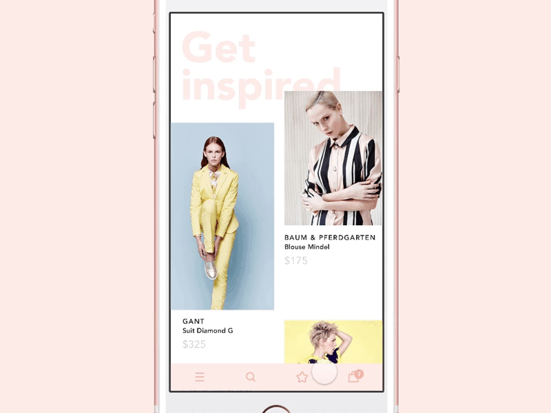
2. Treat colors as a part of user interaction
Color in mobile app design, as in fine art, can stimulate, warn, highlight, and convince. It can draw the user’s attention without saying a word. Today, there are lots of studies of the influence of colors on human behavior and mobile app designers successfully implement the accumulated knowledge.
Color in the hands of designers has become one of the most powerful tools for achieving effective results. Google’s Material Design and Apple’s Human Interface Guidelines say the same thing - the colors of apps and websites should be consistent, distinct and intentional.
- Consistent. No matter restrained or bright colors you use, they must look harmonic and clearly indicate which elements are interactive so that users can notice that such elements are clickable, like in the following example - the shopping cart button stands out on the screen.
- Clear. Color is conditional. It depends on the light that hits and the context of surrounding colors. The same color looks darker and more subdued against the background of bright color, and on the contrary - brighter on the darker background. Skilled designers are aware of how deceptive colors may be and check them when used with text.
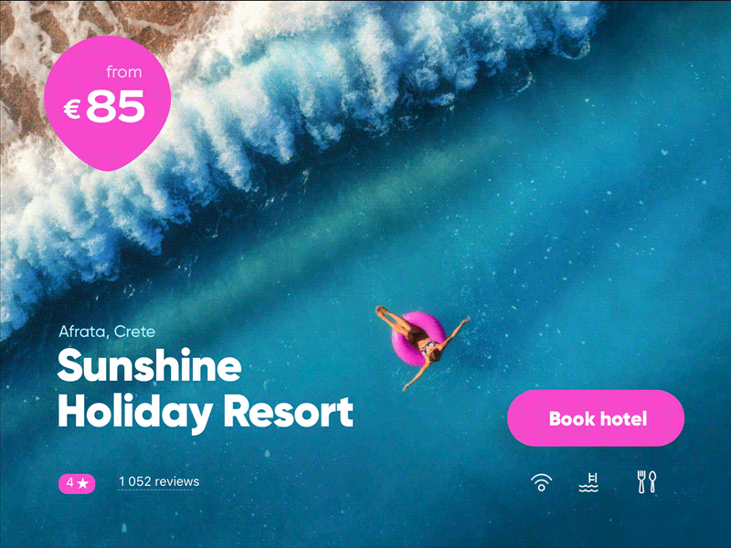
- Deliberate. Color should help users navigate through the app. You can use different colors for different sections in the app, like in the example shown below.
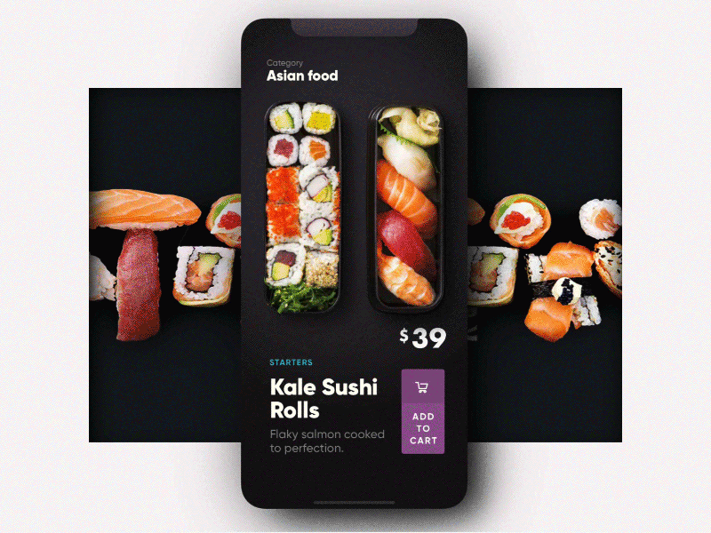
3. Present information gradually
Designing a user-friendly and visually appealing interface can be challenging due to limited screen space (still true, even given the resolution of modern smartphones). It’s important to keep in mind that providing all the information at once can be overwhelming for the user, making it difficult for them to navigate the app efficiently.
The key to creating a great mobile app UI design is to offer a limited set of data at each step of interaction. This helps users focus on the task at hand without being bombarded with an excessive amount of information. By providing a clear and concise user interface, users can easily navigate through the app and complete their desired actions.
For instance, in a Shopping Cart prototype for an iOS app, the most important elements are located at the bottom of the page. This placement ensures that users can quickly access essential information without having to scroll through multiple pages or menus. By clicking on the corresponding icon, users can access detailed content of the shopping cart, such as the product name, quantity, price, and total cost.
4. Use typography in mobile app UI design safely
Texts play not only visual role - they express the identity of the product, being a part of “voice and style” of communication. Now we mix all visual resources that we have around, including icons, emoji, audio and overlapping images in order to achieve decoration and semantic goals.
When it comes to a mobile application design, one of the main criteria is space. Mobile devices are short for space, and designers have to decide what to show and what to hide. In this case, typography is perfect as users perceive it as a graphical element. That’s why experienced designers perceive each word, each letter as elements of the interface. Good typography is the key to easily accessible information.
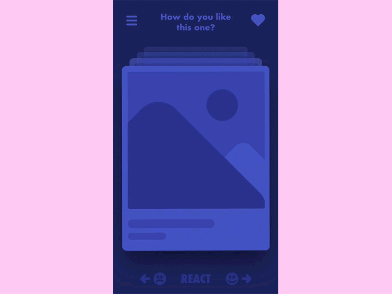
5. Involve user emotions
It is scientifically proven fact that unexpected pleasant things produce a vast amount of natural endorphins. Emotional interface interacts with a user on the level of such things - bright images, animations, videos and associations. Though talks about emotional UI are not new, they change with the development of technology. If previously our everyday communication on the Internet was full of tiny faces that help to understand what we feel, now we have face recognition, augmented and virtual reality and other benefits of machine learning science. How to implement it into your app interface design?
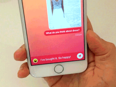
What if we mix gestures and emotional UI? Here is what we have - expressing the emotion by shaking a smartphone. Heavy emoticon users will definitely like this nice feature.
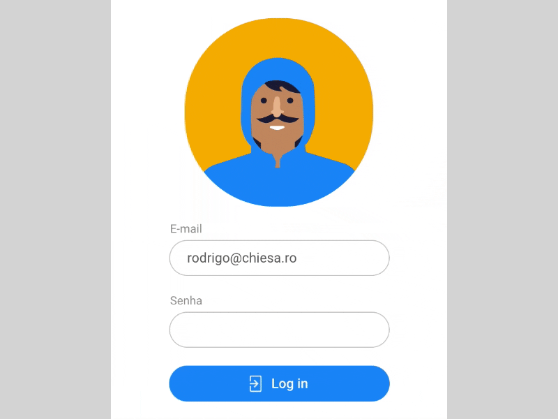
Here is another bright example of emotional interface design. When logging in you see a little man at the profile picture. When you enter your password this guy closes his eyes thus showing that he isn’t peeking. If the password is wrong he turns thumb down, if right - thumb up. Isn’t it funny?
Conclusion
Of course, app UI design is not created for the sake of a beautiful picture. It has its goals. As well as a conductor leads the orchestra with the baton, a skilful mobile app UI designer directs attention of users by shifting focus to necessary UI elements and making them do target actions. Whatever idea of your app may be, we have professionals that can build the design that achieves its desired goals.
For those who have handled reading the article we have a nice bonus - more mobile UI ideas on our Dribbble account.
Don't want to miss anything?
Subscribe and get stories like these right into your inbox.
Keep reading
How Micro Animations Improve UX: Enhance User Engagement
Engagement is crucial for websites and apps in today’s competitive market. To stand out, they must prioritize user experience, making them fast and enjoyable to use.

Is Design Thinking the New Liberal Arts? Most Important Principles
Design thinking is a decision-making method focused on understanding users, challenging assumptions, and redefining issues to uncover alternative solutions.

UX Strategies to Increase Sales on Your Real Estate Website
Every owner of a real estate selling website wants his website to become some kind of a sensation in a housing market and generate leads constantly. Sometimes humble applications with the right idea, and just as important, an outstanding design can grow into a nationwide solution like it happened with one of our projects Agentfolio, an extremely useful tool for buyers and brokers.
Contact us
Let's explore how our expertise can help you achieve your goals! Drop us a line, and we'll get back to you shortly.