How Micro Animations Improve UX
These days engagement is the name of the game when it comes to websites and apps. Brands know that competition in the marketplace is fierce, attention spans are short, and customer loyalty can be fickle. Therefore, websites and apps need to focus on user experience - making a site or app genuinely engaging - interesting or genuinely fun to use, fast loading and intuitive.
Getting all the factors in place that make for a great user experience is an art form in itself, but one particular functional tool designers are increasingly turning to are micro-animations, a form of micro-interaction that can help to bridge software UI and UX design components, and serve a multitude of purposes - from drawing a user’s focus where they want it to go, helping progression through a task or form, providing feedback, answering questions, and even just entertaining.
Ultimately every use of a micro-animation should serve the purpose of enhancing the user experience, and, ultimately contributing positively to a brand’s image.
So what are some of the ways designers can use functional micro-animations in order to enhance user experience?
Feedback
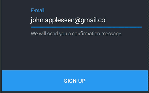
This is one of the most helpful uses of micro-animation when it comes to UX. Giving feedback lets the user know what the result of an action that they have taken is, and whether that result was affirmative or negative.
For example, when entering a password, the correct one may trigger an animated tick before the user is taken to the website, whereas an incorrect password would trigger a result such as the “shake” that has become commonly associated with wrong passwords.
This feedback is important as it answers potential user questions, for instance, “did I enter the correct password?” or “did I press that button?” An instantaneous animated form of feedback to any particular action leaves the user in no doubt as to the result, and means they are not left questioning anything - every process or action the user needs to undertake should be made as frictionless as possible, and direct animated feedback helps to achieve this. Here’s a textbook example from the Wallets app by CardsMobile.
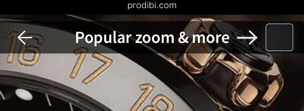
Hints
User satisfaction would take a real hit if a sequence of steps is not obvious, and they are left to either figure out things for themselves or work through a tutorial document or video hosted on a different page, and the last thing a designer wants is to have a situation where a user is left hanging, unsure as to what to do next.
This can be a problem especially if the user interface is unique or different to what many people would be used to. Animated hints can be used to gently nudge the user to take the next required step.
Hints can be especially useful for new users in the onboarding phase, where tutorials can walk the user through each step or feature and show them how to use the site through animated hints. Just don’t make them like Clippy. Remember him? No one likes Clippy. Prodibi does it well in this example.
System Status
Within the user interface, one of the most important things is keeping the user updated with system status. This information needs to provide context and let the user know what is happening and the progress of it without them having to guess.
The most obvious and probably most widely used example of this is the animated loading bar - it lets the user know exactly what process is happening, and shows its progress and tells the user how long it will take.
In fact, these types of micro-animation are useful for any kind of data processing or loading. Any time the user has to wait is detrimental to the user experience and is proven to have an adverse effect on conversions. An Aberdeen study from 2008 found a 1-second delay in load time results in an 11% drop in page views, a 16% decrease in customer satisfaction, and 7% fewer conversions.
Those are whopping figures for a mere 1-second delay. And it’s highly likely user expectations have gotten higher since that study. But micro-animations can help by essentially “hiding” the delay through visual stimulus; keeping the user simultaneously informed and occupied (maybe even entertained) during loading.
Here’s an example from an Apester embedded quiz as it is loading.
Notifications
Micro-animations can provide useful information to users that isn’t directly related to their actions or onsite activity but is valuable nonetheless. Site notifications are a way to subtly draw the user’s attention to information that may be of importance, while simultaneously not being overly obtrusive or disruptive to their experience. These types of notifications include new email or message alerts, and warnings or reminders, such as a trial period coming to an end. This example, again from an Apester quiz, shows how many people are viewing the quiz at any one time.

Navigation
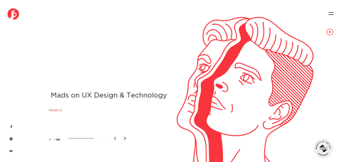
Clarifying exactly how to navigate a site is a big part of bridging the gap between UI and UX. With hierarchical transitions and parent/child and sibling relationships between pages, users need to have some context around where they are, and how to get to and from different sections of a site or app.
Instantaneous transitions can cause confusion as this context is lost. Animated transitions that show a user where objects or pages come from, and where they go and can be found when hidden, make the user experience much better through easier and more intuitive navigation. This sliding menu from The Mads agency is a perfect example
Direct manipulation
Further to the idea of providing animated feedback confirming say, the press of a button through direct touch, animations can also increase the user’s sense of being able to directly manipulate elements on a page. User experience is enhanced when visual evidence of user influence on elements is provided. Think dragging and dropping, swiping on Tinder, or pressing and holding the Messenger thumbs up button.

Rewards
Micro animations can be like high-fives for getting things done right. They don’t need to be extravagant, just a little something to let users know they nailed it. Think of a small thumbs-up, a spunky animated checkmark for submitting a form, or a victorious “success” message after completing a survey.
Not only do micro animations give users a sense of accomplishment, but they also pump up their motivation and engagement. However, it’s crucial not to go overboard and pester users with too many of these snazzy animations.
And let’s not forget about the fun factor! Micro animations can add a spunky personality and excitement to the user interface. By incorporating funky and distinctive micro animations, designers can create an unforgettable and enjoyable experience for users.

Branding
Using micro-animations is one way to enhance the brand experience. This type of animation is more to do with emotion rather than function, but it can increase the emotional engagement of the user with your brand. It offers a point of difference and allows a brand to showcase its personality, what sets it apart from competitors and makes it unique.
This type of animation is a way to delight the user - it could be used to amuse, entertain, tell a short story or highlight features, in a way that is consistent with how the brand wants to be perceived. Branding animation still has a function - encouraging engagement and brand loyalty, but at the same time, it needs to not interrupt the continuity of the user’s experience and use of the website or app.
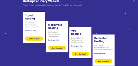
This example from Hostgator is vibrant, whimsical and shows personality, but is unobtrusive, does not interfere with and is consistent with the site.
Conclusion
Micro-animations have the potential to turn any app or website that utilizes them well into a well-crafted, enjoyable, perhaps even memorable experience for the user. A good site should be designed with usability and functionality in mind from layout to navigation, and animation should be used to fill in the gaps. Designed and used well, they will serve to enhance user experience, and in turn, positive sentiment toward your brand.
Don't want to miss anything?
Subscribe and get stories like these right into your inbox.
Keep reading

5 Cool User Interface Ideas for Your Mobile App
UI design blends art and science but is never pure creativity. Inspired by "Good artists copy, great ones steal"? Be cautious—Pablo Picasso didn’t say that, folks.

Is Design Thinking the New Liberal Arts? Most Important Principles
Design thinking is a decision-making method focused on understanding users, challenging assumptions, and redefining issues to uncover alternative solutions.

UX Strategies to Increase Sales on Your Real Estate Website
Every owner of a real estate selling website wants his website to become some kind of a sensation in a housing market and generate leads constantly. Sometimes humble applications with the right idea, and just as important, an outstanding design can grow into a nationwide solution like it happened with one of our projects Agentfolio, an extremely useful tool for buyers and brokers.
Contact us
Let's explore how our expertise can help you achieve your goals! Drop us a line, and we'll get back to you shortly.