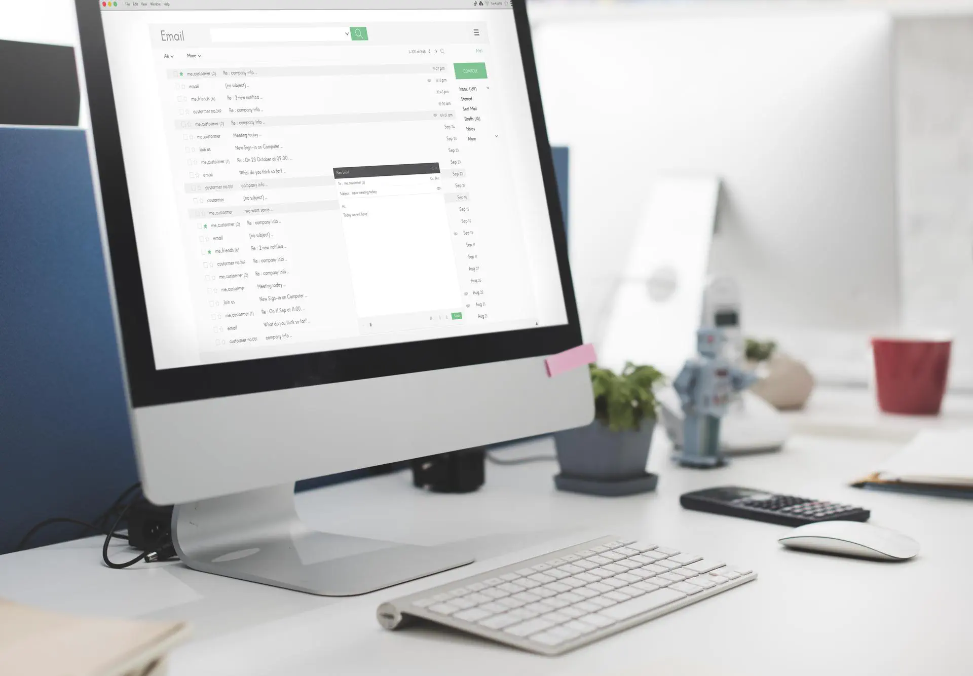
How to Optimize Your Emails for Most Popular Email Clients
We see tons of different emails every day. New arrivings, news feeds, discounts, some advertising and a lot of stuff that we usually skip or delete immediately. In fact, these letters are pretty hard to make. Apart from custom design and good writing, developers have to create an email layout. That is the trickiest part because email can be viewed from way too many devices, OS and browsers. Developers have to keep this in mind and adapt layouts to everything.
I had a chat with Kate Demianenko, frontend developer at Anadea. She told me a lot about email page layout and now we’d like to show some useful tips and tricks for your email campaigns.
Too many species
When you make a simple web page you know that you will open it in a browser or via mobile apps. That makes things less complicated, because you have to work with 4 or 5 browsers and two major mobile OS platforms. You just have to check out how the page is displayed and that’s all.
When it comes to email layouts, this is where the fun starts. Aside from different operating systems and browsers, we also have different email clients. Each of them has its individual displaying methods that work differently with each device, OS and screen width.
Here’s the list of devices, browsers, mail clients and operating systems we need to check (updated as for 2023):
Browsers:
- Firefox (latest version)
- Chrome (latest version)
- Microsoft Edge (latest version)
Mail clients:
- Gmail (latest version)
- Outlook.com (latest version)
- Yahoo Mail (latest version)
Desktop:
- Windows 11 (latest version)
- Outlook 2019
- Outlook 2016
- Outlook 2013
- Outlook 2010
- Outlook 2007
- macOS (latest version)
- Apple Mail (latest version)
- Outlook for Mac (latest version)
Mobile:
- iOS (latest version)
- iPhone 14
- iPhone 14 Pro
- iPhone 14 Pro Max
- iPhone 13
- iPhone 13 Pro
- iPhone 13 Pro Max
- iPhone 13 Mini
- iPhone 12
- iPhone 11
- iPhone XR
- iPhone SE (2nd generation)
- iPad (latest version)
- iPad Mini (latest version)
All of them work differently and have unique layout interpretation which causes unpredictable behaviour. There is a set of rules for this case, but it doesn’t cover every aspect. Marketing evolves and no one sends simple emails with a picture and text these days. Email design creates new ways to deliver ads with emails and it also makes letters and email layout design way more complex. Modern emails look like individual mini-HTML pages with numerous layers that depend on each other.
It is nearly impossible to check all variations, however we found a good way to do it.
Solutions
We use SendWithUs service. It allows you to see all template changes, such as adding a new element or style. It has an option of testing the letter on different devices. After you have chosen the devices and email clients you would like to test, SendWithUs sends a letter to real devices and sends back a screenshot of how they look. So it’s not a big deal if you don’t have some device in your test park.
IOS devices are pretty stable in displaying mails, so we’re not worried about iPhone X. Outlook in Windows is a whole different story. Before you even begin, you should ponder on your approach multiple times. Designers usually do not think about how challenging it is to implement their email design ideas. That’s why we have to estimate the difficulty first, inspect every element and choose the best decision. It may be redefining hundreds of styles using media queries (it’s good that they work everywhere) or just hiding an item and showing a new one. If you don’t want to start the whole process once again, you also have to keep in mind the mobile version.
A few tips and tricks
Forget about regular CSS properties, not to mention CSS3. Outlook won’t display background image if you want to add a text above it. All complex letters are better to implement with a table layout and get used to the fact that there will be a lot of nesting. In return, you can be sure that the proportions will be preserved on all devices.
You still have to use !important, however use it wisely and when it is really necessary, for example, if you need to override the client’s default behavior for displaying any element or in media queries.
It is better to specify all the basic styles inline (use the desktop version of the letter > 600px) and override mobile styles as media queries. Take that as a rule. Also, don’t forget about the attributes of the tags. Notice the selectors in the media queries.
For example:
<style media="only screen and (max-width: 600px)" type="text/css">
  @media only screen and (max-width: 600px) {
     td[class="mobile_width"] {
       width: 16px !important;
     }
   }
</style>
..
<td class="mobile_ver" style="color: #999999; font-size: 12px; line-height: 24px;" width="24"></td>
..
If you don’t want strange indentations or table borders to appear in unexpected places, don’t forget to specify for the table:
cellpadding="0" cellspacing="0" border="0" style="border-collapse: collapse;"
Use <center></center> to align table contents to the center. To align the contents of a cell to the center, use <td align="center></td> or <td style="text-align: center"></td>.
You often need to indent the edges of the container. Forget about padding and margin. Empty lines and cells will help, but there is a small nuance. If you want to be sure that the cell will be the exact width you set and it will not collapse, do not leave it blank and specify a font size and line height:
<td style="font-size: 1px; line-height: 1px"> </td>
Epilogue
Email layout is definitely not a simple task that requires a lot of planning, patience and skills. If you are in it, it will be really handy to have these tricks up your sleeve. When making your next of your email for clients, remember about variety, don’t forget to check the results and things won’t go wrong.
I hope you did enjoy this reading and if you truly did, subscribe to our blog for more information and advices about creating great email layouts and other programming-related topics.
Don't want to miss anything?
Subscribe and get stories like these right into your inbox.
Keep reading

What is a Chatbot and How to Use It for Business Growth
Artificial intelligence is advancing rapidly, and chatbots are becoming a key part of this progress. Messaging apps are driving a growing demand for virtual chatbots.

Artificial Intelligence: Threat or Game-Changer?
Google, Amazon, Facebook, and other tech giants are advancing artificial intelligence systems and exploring their applications. Want to know key issues in AI development?

How to Create a Viable Flight or Hotel Booking App
The flight search and hotel booking industry should be fast and easy. Long queues and blind searches for accommodations are now just scary stories of the past.
Contact us
Let's explore how our expertise can help you achieve your goals! Drop us a line, and we'll get back to you shortly.