


Writing CSS is easy. Scaling CSS and keeping it maintainable is not.
It's true. And it has been repeatedly confirmed in many projects, whether it is a website builder with customizable themes (Getsocio project – 28k lines of CSS code), or a business card website with a relatively small number of styles. Any more or less complex modifications in code due to design changes or adding new pages lead to a long refactoring or, in the most unfavorable case, – to styles duplication. Besides, there is always a risk to break something in an unexpected place.
Issues with CSS scalability
Developers often lose control of CSS code in their projects, often without even realizing it. Signs of this issue may include hesitancy to alter markup for an older widget used in multiple places on the site, difficulties in making changes to styles, guilt about leaving messy code for future maintenance, and even sleep troubles.
Why does this happen? Typically, developers structure their assets based on the design mockups they receive, and this structure initially works well. However, this becomes problematic because the current design is only a small portion of what is to come. At this stage, there are several options to consider. For instance, if there are only two pages, all styles can go into a single file. Alternatively, if there are ten different pages, each with their own unique design, it may seem easier to create a separate style file for each page rather than selecting components and moving them to separate files. While these ideas may seem reasonable based on the current design aspects, few developers consider how the project may change in the future, such as in five years' time.
CSS has has some weak points which lead to the problems listed above. In a recent report (React: CSS in JS), that triggered many discussions among the frontend developers, one of Facebook employees announced the problems with CSS scalability. Among them: using of the global namespace, dead code elimination, isolation and so on. In the end, he proposed to store styles in JavaScript. This interesting but rather drastic solution is not always applicable to developing the ordinary sites, when their pages are rendered on the server. Many companies, not only Facebook, are trying to solve the issues of using CSS at scale. So, there are many approaches to writing styles today. One of the most interesting of them is BEM methodology, which was born in Yandex.
What is BEM?
BEM (Block Element Modifier) is a powerful methodology that provides a solution for creating the project architecture and improving CSS performance. It does not only dictate the structure of CSS but also the structure of templates and scripts. A rich toolset for automatic code generation, produced by Yandex developers, also helps to organize the development process. Now we are interested in the part that concerns the styles. Fortunately, the methodology of developing front-end with BEM is quite flexible and it encourages users to run experiments and to take only those parts, which are helpful in their projects development.
Let’s talk about BEM basic concepts. A block – an independent component of the page that encapsulates the behavior (JavaScript) and appearance (CSS). Due to the independence of the block it can be reused anywhere on the page. An element - a part of the block, can’t be used outside of it. A modifier - an entity that alters the appearance of a block or an element according to the application state or design requirements. If needed, several blocks can be used on a single HTML element. In BEM terminology this method is called Mix.
Using BEM for solving issues with CSS
Now we can return to our issues and look at the solution which BEM offers. The first problem is a global namespace. Let's assume that we have a navigation menu.
<ul class="toolbar">
  <li class="item edit">
    <a href="/edit">Edit</a>
  </li>
  <li class="item delete">
    <a href="/delete">Delete</a>
  </li>
</ul>
And styles for it
.item {
  display: inline-block;
  padding: 5px 10px;
  margin: 0 10px;
}

.edit {
  padding-left: 20px;
  background: url('edit-icon.png');
}
If some other component, containing a list item (item) or an element associated with editing (edit), suddenly appears on the page, the new styles will affect the existing ones.
<div class="user-profile">
  <span class="email">john.doe@example.com</span>
  <a class="edit">Change email</a>
</div>
.edit {
  background: url('edit-email-icon.png');
}
In this example, the problem is resolved by introduction of two components. toolbar and user-profile are the names of these components in the global namespace. Then we define styles of internal elements within these components.
.toolbar .edit {
  ...
}

.toolbar .item {
  ...
}

.user-profile .edit {
 ...
}
However, such solution does not scale well. If we imagine more complicated components (page, company-preview, user-post), we will get the same problem, but within the single component. Defining the selectors, for example .page > .edit, is a very bad idea because it creates coupling between the HTML templates and representation. Making changes in the template will require to change the style too. Furthermore, by adding a class to the selector, we change its specificity. And this, in turn, complicates the overriding CSS rules for the element. The classes for increasing specificity emerge in other places and the race of selectors starts, causing a huge headache for front-end coders.
BEM CSS rules suggest to reject the cascading and thus uniquely define the element.
<ul class="toolbar">
  <li class="toolbar__item toolbar__item_edit">
    <a href="/edit">Edit</a>
  </li>
  <li class="toolbar__item toolbar__item_delete">
    <a href="/delete">Delete</a>
  </li>
</ul>
.toolbar { ... }
.toolbar__item { ... }
.toolbar__item_edit { ... }
.toolbar__item_delete { ... }
Nested elements, belonging to the block, will use this block name toolbar as a prefix. __ serves as a separator between block and element. And _ is a separator between the BEM-entity (in this case the element) and modifier. Here toolbar__item_edit and toolbar__item_edit – are the modifiers of toolbar__item element.
Unwittingly, we have solved a number of problems at one fell swoop. Now the elements are encapsulated within the blocks and isolated from the other elements. To describe the styles of the block and its elements, a separate file or even a folder on the file system can be allocated. Therefore, only by looking at the structure of the project, we can define what is there in a global space. It becomes easier to track the hierarchic relationships within the block. CSS code becomes self-documenting. The search of selectors within the project, as well as modification of styles and removal of unused code, are getting much easier.
The key things to keep in mind
It remains to talk about self-discipline. In order to fully exploit the gained advantages, it is necessary to follow some rules and recommendations. You can keep in mind the following checklist:
- The positioning of block is defined by the parent.
- The classes (not ids) are used for describing the entities.
- It is not allowed to create the elements of the elements (
block__elem1__elem2). - The names of the modifiers and elements always contain the name of the block as a prefix.
- The preceding paragraph implies that you cannot create global modifiers.
- The blocks may not contain the nested elements (
link) - The blocks can enclose the entire content of the page or its major parts (
page,page-section).
To keep the portability of the block for different parts of the page it is desirable that the positioning and sizes of the block (margin, top, left, width) are defined by the parent.
How it works and examples
Now, let's suppose that our toolbar is located inside the block header and should fill its right half. The solution may look like the following.
<header class="header">
  <div class="header__toolbar">
    <ul class="toolbar">
      <li class="toolbar__item toolbar__item_edit">
        <a href="/edit">Edit</a>
      </li>
      <li class="toolbar__item toolbar__item_delete">
        <a href="/delete">Delete</a>
      </li>
    </ul>
  </div>
</header>
.header { ... }
.header__toolbar {
  float: right;
  width: 50%;
}
CSS code of block toolbar remains unchanged.
There is one more important question. In which case to create the block and in which to make the element? If a piece of code doesn't depend on the other components of the page, you have to create the block. If it doesn't make sense outside the context of the parent, the element is created.
Let us look at another example. Assume we got the following design of toolbar.
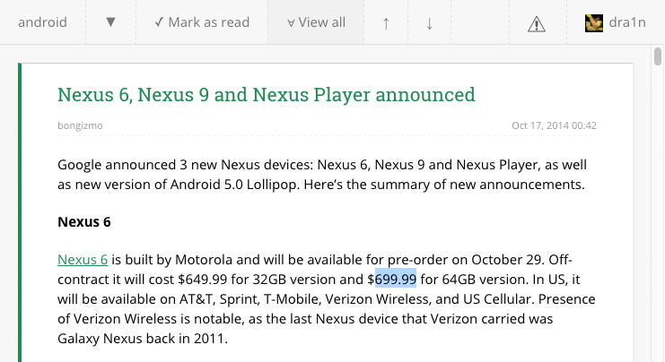
After sorting out the requirements, we found out the first element of the toolbar is a text-based information about the current page. The subsequent elements are the buttons and some of them are in the “ON” state. The last two elements of the toolbar always should be on the right, so there will be a separator between them and the other elements. Let's try to write markdown for this block.
<div class="toolbar">
  <div class="toolbar__item toolbar__text">
    android
  </div>
  <a class="toolbar__item toolbar__button">▼</a>
  <a class="toolbar__item toolbar__button">✓ Mark as read</a>
  <a class="toolbar__item toolbar__button toolbar__button_toggled">∀ View all</a>
  <a class="toolbar__item toolbar__button">↑</a>
  <a class="toolbar__item toolbar__button">↓</a>
  <div class="toolbar__item toolbar__spacer"></div>
  <a class="toolbar__item toolbar__button">
    <img class="toolbar__icon" alt="errors" src="/errors.svg" />
  </a>
  <a class="toolbar__item toolbar__button">
    <img class="toolbar__icon" alt="avatar" src="/avatar.jpeg" />
    <span class="toolbar__text">dra1n</span>
  </a>
</div>
Here, in order to avoid duplication of the common styles for each element of the toolbar block, we detach toolbar__item and use the mix with the other elements: toolbar__button, toolbar__spacer and toolbar__text. Some elements are nested but the inner substructure of the block is still flat. So, the rule that you can't create the elements of the elements isn't violated. And one more thing - all elements requiring styling have classes, including img.
Final notes
In conclusion, we can say that following the principles of BEM, described in this tutorial, allows to get scalable and maintainable CSS, which will increase the speed of development and will simplify the understanding of the code by new developers. For all that, only the convention for naming elements is used and no additional tools required. If you are using CSS and HTML then you already have sufficient technology stack in your project to introduce the advantages of BEM methodology in your CSS code right now.