


Among numerous methodologies of styles organization (BEM, SMACSS, OOCSS, SUITECSS) one really stands out - CSS Bliss. It is the quintessence of usability and readability.
To start, we need to establish the fundamental ideas: module, element, and modifier. These concepts are similar to those in BEM, with the exception that Block is referred to as Module in CSS Bliss. As we progress, it will become apparent why Module is a more appropriate term. Although the methodology shares many similarities with BEM, it also has its unique characteristics. These differences merit individual consideration since they are precisely what enables CSS Bliss to surpass other CSS methodologies.
The main differences of CSS Bliss
1. Naming of module, elements and modifiers
In BEM, the main separators are "-" and "_":
.my-module__my-element_modifier
but CSS Bliss improves readability by using capital letters:
.MyModule-myElement--modifier
As for me, it is very difficult to distinguish between a dash and an underscore, even more so if they look almost identical with the only difference in a shift for a couple of pixels down. Whereas capital letters highlight and divide into words the parts which represent a single name.
Perhaps, it's not clear through an abstract example. Let's take an example closer to a real project. Compare:
<li class="custom-user-menu__list-item_size-normal"></li>
<li class="CustomUserMenu-listItem--sizeNormal"></li>
The first BEM's version is longer and more complicated to read. Especially its modifier, which merges with the name of the element. The second (CSS Bliss) is more compact and is visually split up into understandable components: module, element and modifier. Moreover, the difference in the first letter instantly allows us to understand what we're looking at: a module or an element (a module begins with a capital letter, while an element starts with a lowercase one).
If I still haven't convinced you, here's another example from BEM documentation for "key-value" modifiers:
.block-name__elem-name_mod-name_mod-val
It is difficult to imagine where such unreadable constructions could be of any use. To my mind, it would be more appropriate to use either another name or find another way of splitting into elements and modifiers.
2. Components positioning
A module is designed to be self-contained and stand on its own, with a consistent appearance across different contexts and screen sizes. To achieve this, a module must adhere to an important rule: it should not include properties that strictly determine its placement, such as its size (width), external padding (margin), or positioning relative to other elements (position). Instead, these properties should be defined in a module modifier or by making the module an element of an external block that sets its position.
This important difference makes modules really independent from neither their location on a page nor screen size. It is easy to reuse them.
3. Structure organization
Although BEM has a conveniently organized file structure, it suggests excessive subdivision: each modifier and element is stored in a separate file. Here's an example:
blocks
├─── popup
| ├──── _target
| | ├──── popup_target.css
| | ├──── popup_target_anchor.css
|  nbsp; | └──── popup_target_position.css
| └──── _visible
| ├──── popup_visible.css
| ├──── popup.css
| └──── popup.js
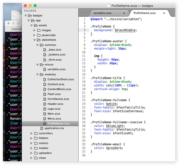
Meanwhile, CSS Bliss implies creating files only for modules. Its internal elements and modifiers are specified inside this very file, because they don't make any sense outside of it.
css

├─── modules

|        ├──── _PopupDialog.scss

|        ├──── _Btn.scss

|        └──── _ElmInfo.scss

├─── _base.scss

├─── _colors.scss

├─── _mixins.scss

├─── _zindex.scss

└─── application.scss
In addition, you can create common files for the whole project, which is also very handy.
4. The state of an element
Very often we have to define the state of an element or a module: active, hidden, available, used and so on. Using a modifier for this purpose not only obstructs the readability of html, but also pollutes javascript.
An example in BEM CSS style:
<div class="my-module__my-mlement my-module__my-mlement_my-modifier-with-state"></div>
An example in Bliss CSS:
<div class="MyModule-myElement isState"></div>
In the latter example, in order to change the state in js, we use customary and universal "isState" instead of a long modifier name "my-module__my-element_my-modifier-with-state". As the state is defined only for a certain module or element, it has only local impact on them. And if need be, a universal name of the state allows to reuse the js-code for different elements of the page.
5. The use of @extend
Personally, I'm against using such ability of sass as extending classes with the help of @extend. The main requirements to CSS should be:
- simplicity,
- readability,
- easy changeability.
With the help of @extend you extend original classes with an additional code, what is more, from any other place. In spite of the apparent simplicity of the concept, @extend fundamentally contradicts the basic principle of cascading styles; makes it difficult to manage and read the code. No wonder that CSS Bliss doesn't allow using @extend for classes and elements.
6. Documentation
Apart from the usual documentation on the site that describes CSS Bliss, there exists an interactive walkthrough with examples for developers. Here you can not only check your knowledge in correct understanding of the methodology, but also work out through actual examples how it is better to solve particular tasks with the help of CSS Bliss.
It's the best applied documentation I have ever seen.
Conclusions
Despite the wide popularity of BEM in recent times, the overall blend of all pros and cons of Bliss CSS allows to conclude that it is much more practical. Like other methodologies, it develops the habit of thinking not in terms of a page, but in terms of its components: modules, elements, modifiers. This makes the process of writing CSS more self-conscious, because the correct splitting into components determines not only the beauty of the code but also the viability of styles in the future.