


"We are not designing pages, we are designing systems of components."
~ Stephen Hay
A style guide is a set of corporate standards. A guide on using the brand style which defines the corporate colors, fonts, forms and blocks, size of elements and layout. This is a detailed description of design patterns for each element separately and, when necessary, together with other components.
Introduction
There are dozens of various style guides - starting from the ones for design and ending with the coding guidelines for different programming languages. They may have different names, but all of them have the same mission: to create general corporate rules. One of the first style guides were brand books.
A brand book is a formal document used by a company that outlines its brand concept, including attributes, target audience, and positioning. It serves as a guide for the marketing department and business executives in communicating with customers and for the overall development of the company. Additionally, a brand book provides guidelines for using all brand elements on different media, including advertising and corporate relations, and includes a complete corporate identity manual.
The depth and extent of a company's brand book is typically proportional to the size of the company. Small businesses, for example, may only require a logo and corporate colors.
Besides the brand book, there is another important document called the sales book, or corporate sales book. It is a comprehensive document that outlines the entire process of customer interaction, the company's standards, and the unique characteristics of its products. While the primary audience for this document is the sales department, it has a wider role in the company, as it familiarizes all employees with the company's ethical standards, saving time and reducing the need for extensive training. Additionally, the sales book helps to preserve valuable experience within the company and encourages knowledge sharing among different departments.
Style guides for developers
As was mentioned above, every programming language has its own style guide, a set of rules for writing and organizing the code:
But these are style guides with very narrow specifics. What do they mean in the wide sense? What functions should they perform?
In my earlier article I talked about documenting CSS by reviewing how it can be done using KSS. However, does this method of defining style guides encompass the full range of application components?
In the general case, this is a set of rules that should be used by all developers: system architects, designers, front-end and back-end engineers. It is also very useful for managers and owners of the application when they need to discuss some updates or add new features.
Many companies store their style guides on their websites on a separate page. This way, they are always available online.
Depending on your web application, they may look completely different, here are some examples:
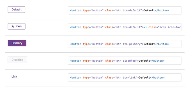
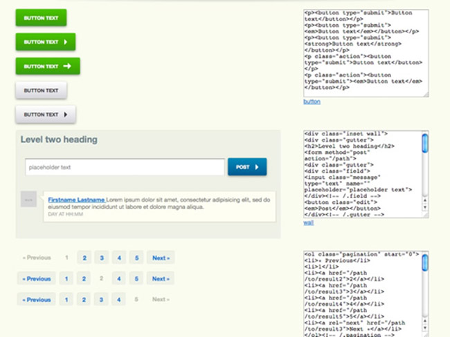
Example 1:
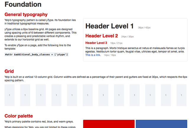
Example 2:
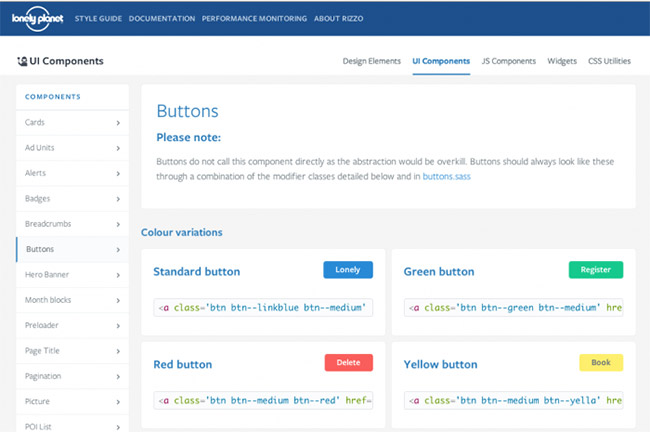
Example 3:
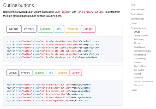
Example 4:
Example 5:
The advantages of style guides
1. Easy testing
When all the components are on the same page, it is easy to see when the behavior of one component affects the other one, if there any styles overlapping, whether the styles suit each other well and fit into the general model of the site. It is handy to test them on different platforms: mobile, tablet and desktop. To test the component, you do not have to go to the website (sometimes, in order to do this, it is necessary to log in as a user with special rights and go to a page accessible under certain conditions). Here, it is enough to look into the style guide because it is "live" and reflects the current state of the used components.
2. Streamlined workflow
A style guide encourages us to think not in terms of pages, but rather in terms of the project functionality split into small parts. Sticking to this process starts at the stage of application design, so everyone in the team follows it. This allows to easily incorporate new developers into the project due to the next point.
3. Common dictionary
It is not only a common dictionary of component's names, it also involves names of inner elements. It is straightforward and precise.
4. A convenient reference
For designers and managers it is a place that reflects the current stage of the project. Here you can see which elements already exist, which ones require revision and which do not exist at all. For instance, the statuses of errors or notifications, which are often forgotten.
Therefore, a web development style guide is an up-to-date documentation with a refined detalization of elements and modules along with handy visualization. It is a mean of communication between project architects, designers, developers and managers.
Development of an application with a style guide
The process of application development looks like this:
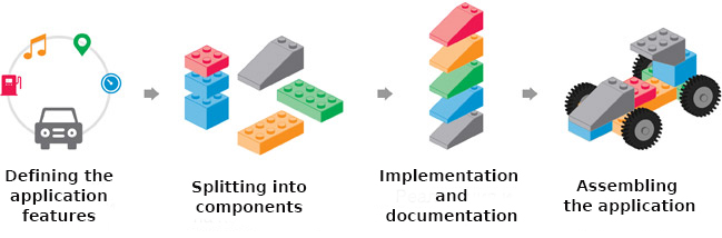
1. Defining the application features
Usually, the design starts from creating a color palette, typography and drawing the application page by page. This approach will cause many problems for developers in the future, because it does not provide the project scalability but just piles up more and more new pages. It is not a good option. Having a style guide implies that at the first stage, in addition to design solutions, basic elements should be distinguished. These elements may be used several times or expanded.
2. Splitting into components
Allocation of the components, adding new or extending the existing ones is impossible without close cooperation between a designer and a programmer. At this stage, the style guide is being updated because it should always reflect the current stage of the project development.
3. Implementation and documentation
This stage involves the implementation of components taking into account their appearance and behavior. A new component should conform with the existing ones and possess quality inherent to all components: to have enough flexibility and integrity, so that it can be used under various conditions and in different scenarios. It is also a good time for creating unit-tests and documentation.
4. Assembling the application
Everything is clear at this point. We already have a set of finished components, which can be used to build a single application. We can easily check how various scenarios work and write integration tests.
Conclusion
Initially, this article was supposed to be only about style guides for web design and development. However, digging deeper into them you realize that this approach (breaking into components) works very well not only for styles. Components are small blocks that constitute everything around:
- In functional programming these are pure functions. In OOP it is just correctly written functions, small ones that implement some pieces of logic but without side effect, not influencing the operation of other functions and methods.
- HTML: dividing into pre-used blocks (partials).
- CSS: a methodology of web development - BEM (Block Element-Modifier) or its enhanced counterpart - CSS Bliss. Both approaches perfectly fit into the structure of components. In Bliss, a separate file is created for each component. This file contains the description of styles for this component and for nested elements and modifiers.
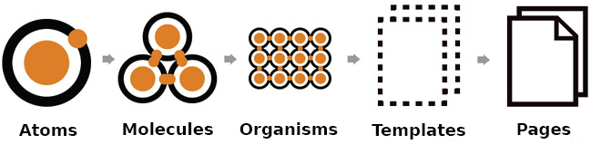
- In design, components are the elements that constitute the prospective layout. For example, as a specific instance we can take Bootstrap: a set of predefined components, such as headings, buttons, text, columns, menus, etc. In a more general case, it is constructing large applications of smaller components, which in their turn, consist of even smaller parts. This is the basic idea of Atomic design, which may be described by the epigraph to this article - a saying of the famous designer Stephen Hay ("We are not designing pages, we are designing systems of components.") - and illustrated by the following outline of design creation:
Links:
- Style guide resources - a huge collection of articles, tools, books, podcasts and other resources on how to create a web design style guide.
- A set of generators for creating style guides for web sites and apps.